Chapter 6: Map Making (3) Timeseries, Cartogram & Bivariate Visualization
6.1 Lab Goals
Chapter 4 and Chapter 5 have introduced the fundamentals of spatial data manipulation and map-making, particularly, producing single-variable thematic maps. In this chapter, we will learn to:
- visualize time series data
- create cartograms
- make bivariate choropleth map
6.2 Good Practice
6.2.1 Organizing Folders & Sub-folders
Under the course folder, please create a folder called “lab6”. Next, in the lab6 folder, please create two sub-folders including a “data” folder and a “plot” folder.
6.2.2 Data
This chapter continues to explore spatial data sources other than US Census Bureau. We will use the 311 Service Requests in 2023 and Parks, Medians, and Parkway Trees.
311 data contains pertinent information related to inquiries and service requests for the City and County of Denver. It is aggregated, often publicly available, records of non-emergency service requests, questions, and complaints made by residents to local government through the 311 system.
Please follow the steps below to download data, unzip it and move the data to the required folder.
- Go to https://github.com/fuzhen-yin/uccs_geoviz/blob/main/docs/data/lab6_data.zip
- Download the file “lab6_data.zip”
- Unzip folder “lab6_data.zip”
- Move all files from the “lab6_data” folder to the “data” folder under “lab6” see Step 6.2.1
If there you have any questions about the above-mentioned steps, please refer to Chapter 3.2.3 for detailed instructions.
6.2.3 Launching R Studio
Again, we would like to start a new project from scratch with a clean R Script. Please do the following steps. If you have any questions about these steps, please refer to the relevant chapters for help.
- Step 1: Make sure all existing R projects are properly
closed.
- If not, please close it by going to File –> Close Project –> Save changes (see Chapter 2.5).
- Step 2: Create a New Project using Existing Directory, navigate to lab6, click open, then Create Project. (see Chapter 1.3).
- Step 3: Create a New Script by go to File –> New File –> R Script. Save the script by giving it a proper name.
6.2.4 Before Start
Heads-Up!
All scripts are non-copyable. When writing codes, please try to understand:
- Code logics
- Purposes of each line and function
- the input and output
6.3 Libraries & Input Data
Load libraries.
### Library
library(dplyr) # data manipulation
library(tidyverse) # tidy data
library(reshape2) # one-hot encoding
library(sf) # simple features
library(geojsonsf) # read geojson
library(tmap) # mapping
library(ggplot2) # plot
library(viridis) # viz - color
library(cartogram) # map - cartogram
library(pals) # bivariate color palette
library(corrplot) # correlation matrix Input data
# Denver neighborhood (geojson --> simple features)
sf_den_ngbr <- geojson_sf("data/Denver_neighborhood.geojson")
# Denver 311 service requests (csv -- > data frame)
df_den_311 <- read.csv("data/2023_denver_311_service_request_cleaned.csv")
# Denver Trees (around 1 minute to read the data)
sf_den_tree <- geojson_sf("data/denver_trees.geojson")6.4 Viz: 311 Service Requests by Week
In the previous chapter, we have played with AirBnb data.
This week, we will play with 311 Service Requests in Denver. 311 is a special telephone number supported in many communities in the United States that provides access to non-emergency municipal services like reporting abandoned vehicles, noise complaints, and graffiti.
6.4.1 Exploring 311 data
Before any analysis and visualization tasks, the first step is to learn about the data and check what are the attributes (or columns) in the data.
[Q1] In your opinion, which column in
df_den_311 is most interesting and briefly explain why.
# open data
View(df_den_311)Let’s have a look at the distributions of variables, e.g., the
Agency. The table() builds a contingency table
of the counts at each combination of factor levels
# contingency table of the attribute 'Agency'
tb_311_agency_freq <- table(df_den_311$Agency)
head(tb_311_agency_freq)##
## 311 City Council
## 8818 189
## Clerk & Recorder Community Planning & Development
## 375 21586
## Excise & License External Agency
## 9870 3965Create a barplot to show the count of agencies mentioned in the 311 dataset.
# plot: contingency table
barplot(tb_311_agency_freq, main="311 Requests - Agency", las=2, cex.names = 0.5)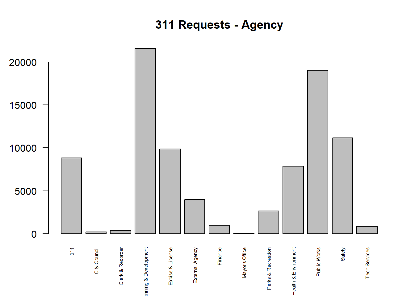
6.4.2 Data Type
Check data type of each column. [Q2] What is the
data type of the column Case_Created_dttm.
# data type
str(df_den_311)## 'data.frame': 87321 obs. of 13 variables:
## $ ObjectId : chr "ID000001" "ID000002" "ID000003" "ID000004" ...
## $ Case_Created_dttm : chr "Sun, 31 Dec 2023 14:50:12 GMT" "Sun, 31 Dec 2023 13:25:09 GMT" "Sun, 31 Dec 2023 11:00:02 GMT" "Sun, 31 Dec 2023 13:30:04 GMT" ...
## $ Case_Closed_dttm : chr "1/2/2024 6:55:27 AM" NA "1/8/2024 1:55:27 PM" NA ...
## $ Incident_Address_1 : chr "5063 W Radcliff Ave" "2929 S Elm St" "2222 N Broadway" "9132 E 34th Ave" ...
## $ First_Call_Resolution: chr "Y" "Y" "Y" "Y" ...
## $ Case_Summary : chr "ROWE - Driveway Block" "Snow Removal Complaint/Sidewalk" "Business Complaint" "Snow Removal Complaint/Sidewalk" ...
## $ Case_Source : chr "PocketGov" "PocketGov" "PocketGov" "PocketGov" ...
## $ Council_District : int 2 4 9 8 7 1 0 8 1 8 ...
## $ Case_Status : chr "Closed - Answer Provided" "Routed to Agency" "Closed - Answer Provided" "Routed to Agency" ...
## $ Longitude : num -105 -105 -105 -105 -105 ...
## $ Latitude : num 39.6 39.7 39.8 39.8 39.7 ...
## $ Agency : chr "Public Works" "Community Planning & Development" "Excise & License" "Community Planning & Development" ...
## $ Police_District : int 4 3 6 5 4 1 0 5 1 5 ...The column Case_Created_dttm records at what date and
time the “311 request” was received. Let’s convert this column to a
particular data type as ** date **. Read more
about the datetime format in R.
# have a look at the first values in column "Case_Created_dttm"
head(df_den_311$Case_Created_dttm) ## [1] "Sun, 31 Dec 2023 14:50:12 GMT" "Sun, 31 Dec 2023 13:25:09 GMT"
## [3] "Sun, 31 Dec 2023 11:00:02 GMT" "Sun, 31 Dec 2023 13:30:04 GMT"
## [5] "Sun, 31 Dec 2023 13:25:17 GMT" "Sun, 31 Dec 2023 10:40:02 GMT"# convert the data type of "Case_Created_dttm" as "date"
df_den_311$case_create_date <- as.Date(df_den_311$Case_Created_dttm,
format = "%a, %d %b %Y %H:%M:%S")
# extract week numbers
df_den_311$case_create_wk <- strftime(df_den_311$case_create_date,
format = "%V") %>% as.numeric()[Q3] After transformation, What is the data type of
the column case_create_date?
# Check data type again.
str(df_den_311)## 'data.frame': 87321 obs. of 15 variables:
## $ ObjectId : chr "ID000001" "ID000002" "ID000003" "ID000004" ...
## $ Case_Created_dttm : chr "Sun, 31 Dec 2023 14:50:12 GMT" "Sun, 31 Dec 2023 13:25:09 GMT" "Sun, 31 Dec 2023 11:00:02 GMT" "Sun, 31 Dec 2023 13:30:04 GMT" ...
## $ Case_Closed_dttm : chr "1/2/2024 6:55:27 AM" NA "1/8/2024 1:55:27 PM" NA ...
## $ Incident_Address_1 : chr "5063 W Radcliff Ave" "2929 S Elm St" "2222 N Broadway" "9132 E 34th Ave" ...
## $ First_Call_Resolution: chr "Y" "Y" "Y" "Y" ...
## $ Case_Summary : chr "ROWE - Driveway Block" "Snow Removal Complaint/Sidewalk" "Business Complaint" "Snow Removal Complaint/Sidewalk" ...
## $ Case_Source : chr "PocketGov" "PocketGov" "PocketGov" "PocketGov" ...
## $ Council_District : int 2 4 9 8 7 1 0 8 1 8 ...
## $ Case_Status : chr "Closed - Answer Provided" "Routed to Agency" "Closed - Answer Provided" "Routed to Agency" ...
## $ Longitude : num -105 -105 -105 -105 -105 ...
## $ Latitude : num 39.6 39.7 39.8 39.8 39.7 ...
## $ Agency : chr "Public Works" "Community Planning & Development" "Excise & License" "Community Planning & Development" ...
## $ Police_District : int 4 3 6 5 4 1 0 5 1 5 ...
## $ case_create_date : Date, format: "2023-12-31" "2023-12-31" ...
## $ case_create_wk : num 52 52 52 52 52 52 52 52 52 52 ...6.4.3 Top 5 Service Reuqests Categories
The column Case_Summary categorizes people’s 311
requests into different types. Let’s check what issues that people have
reported and their frequency.
[Q4] What are the top 5 categories of 311 service requests?
# Case summary - contingency table - ordered by frequency
df_311_summary <- table(df_den_311$Case_Summary) %>%
as.data.frame() %>% arrange(-Freq)# check
View(df_311_summary)OK, there are over 1000 categories of service requests. Let’s only
focus on the top 5 frequently mentioned category and save it as a new
data df_den_311_top.
# extract 311 requests in the most mentioned categories
df_den_311_top <- df_den_311 %>%
filter(Case_Summary %in% df_311_summary$Var1[1:5]) %>%
select(case_create_wk, Case_Summary) %>%
mutate(n=1)Count the number of 311 service requests in the top 5 categories by week.
# (one-hot encoding)
df_den_311_top <- dcast(df_den_311_top,
case_create_wk ~ Case_Summary,
fill = 0, value.var = "n",
fun.aggregate = length)
head(df_den_311_top)## case_create_wk Application Encampment Reporting Sheriff - Abandoned vehicle
## 1 1 26 180 63
## 2 2 43 305 57
## 3 3 43 187 40
## 4 4 30 170 47
## 5 5 40 232 60
## 6 6 46 279 47
## Snow Removal Complaint/Sidewalk Weeds/Vegetation Violation
## 1 1732 1
## 2 1169 0
## 3 1221 5
## 4 847 1
## 5 516 3
## 6 177 9From here, we are going to change the structure of the data
df_den_311_top and reshape (or tidy) it in a specific
way so that:
- Each variable must have its own column.
- Each observation must have its own row.
- Each value must have its own cell.
The process if tidying is illustrated in Figure 6.1. 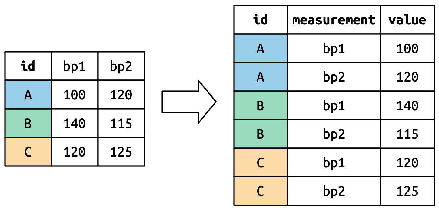
# Tidy data using the function pivot_longer()
df_den_311_top_tidy <- df_den_311_top %>%
pivot_longer(cols = 2:ncol(.), names_to = "category", values_to ="count")[Q5] Please compare the two datasets before and
after tidying, e.g., df_den_311_top and
df_den_311_top_tidy. Try to use your own words to explain
how the “tidy” process changes the data structure.
# BEFORE tidying: "df_den_311_top_tidy"
View(df_den_311_top)
# AFTER tidying: "df_den_311_top_tidy"
View(df_den_311_top_tidy)6.4.4 Time Series Plot
Let’s make a basic plot exploring how the top 5 categories of 311
requests change over times (by week) by using the tidied data
df_den_311_top_tidy.
# viz: time series
p1_311 <- ggplot(df_den_311_top_tidy,
aes(x=case_create_wk, y=count, fill=category)) +
geom_area(alpha=0.6 , linewidth=.5, colour="white")
# print plot
p1_311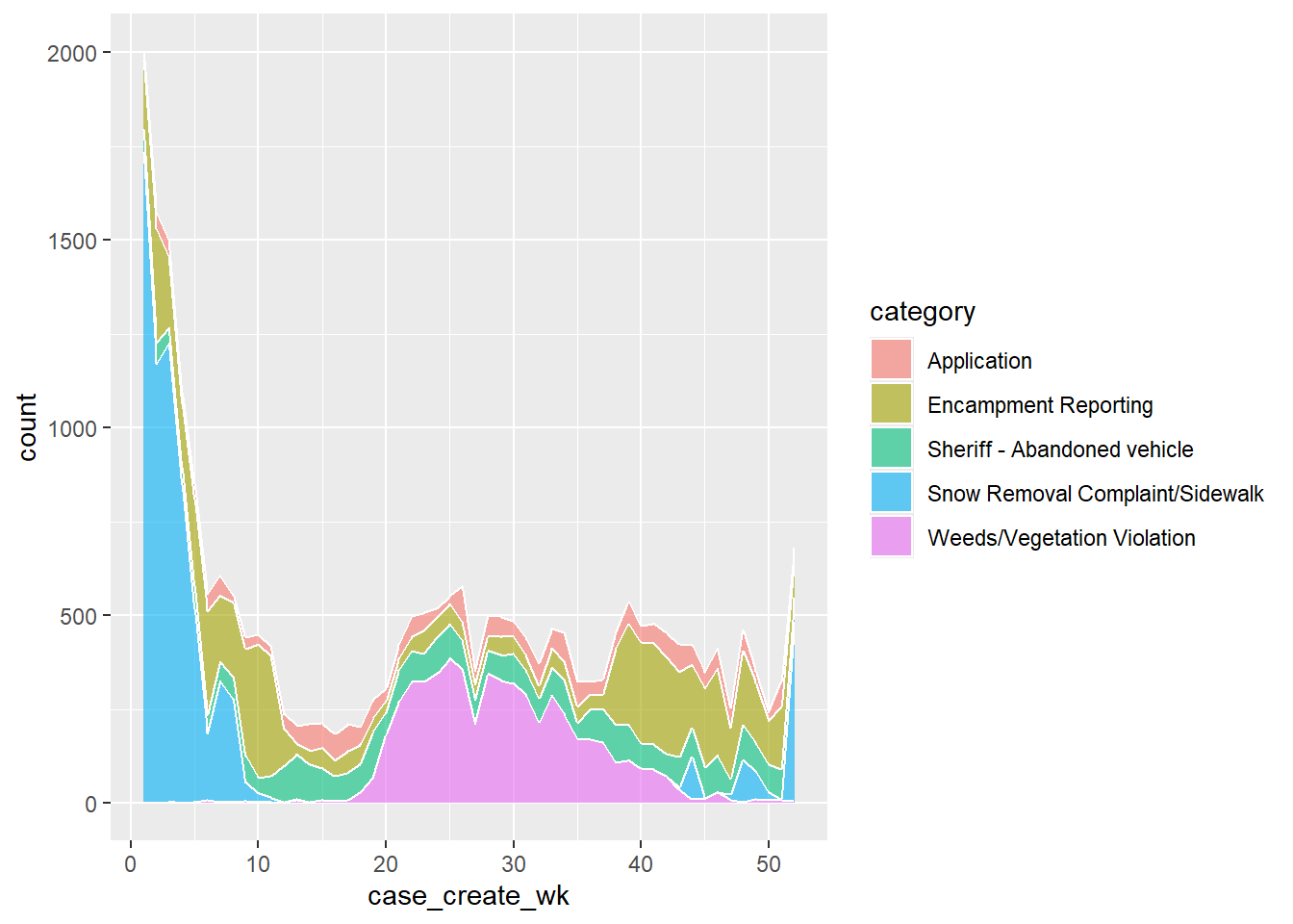
Improve the plot by using the viridis color palette
from the viridis library.
# viz: improve
p2_311 <- ggplot(df_den_311_top_tidy,
aes(x=case_create_wk, y=count, fill=category)) +
geom_area(alpha=0.6 , linewidth=.5, colour="white") +
scale_fill_viridis(discrete = T) +
theme_bw() +
xlab("Weeks in 2023") +
ylab(" Count of 311 Service Requests")
# print plot
p2_311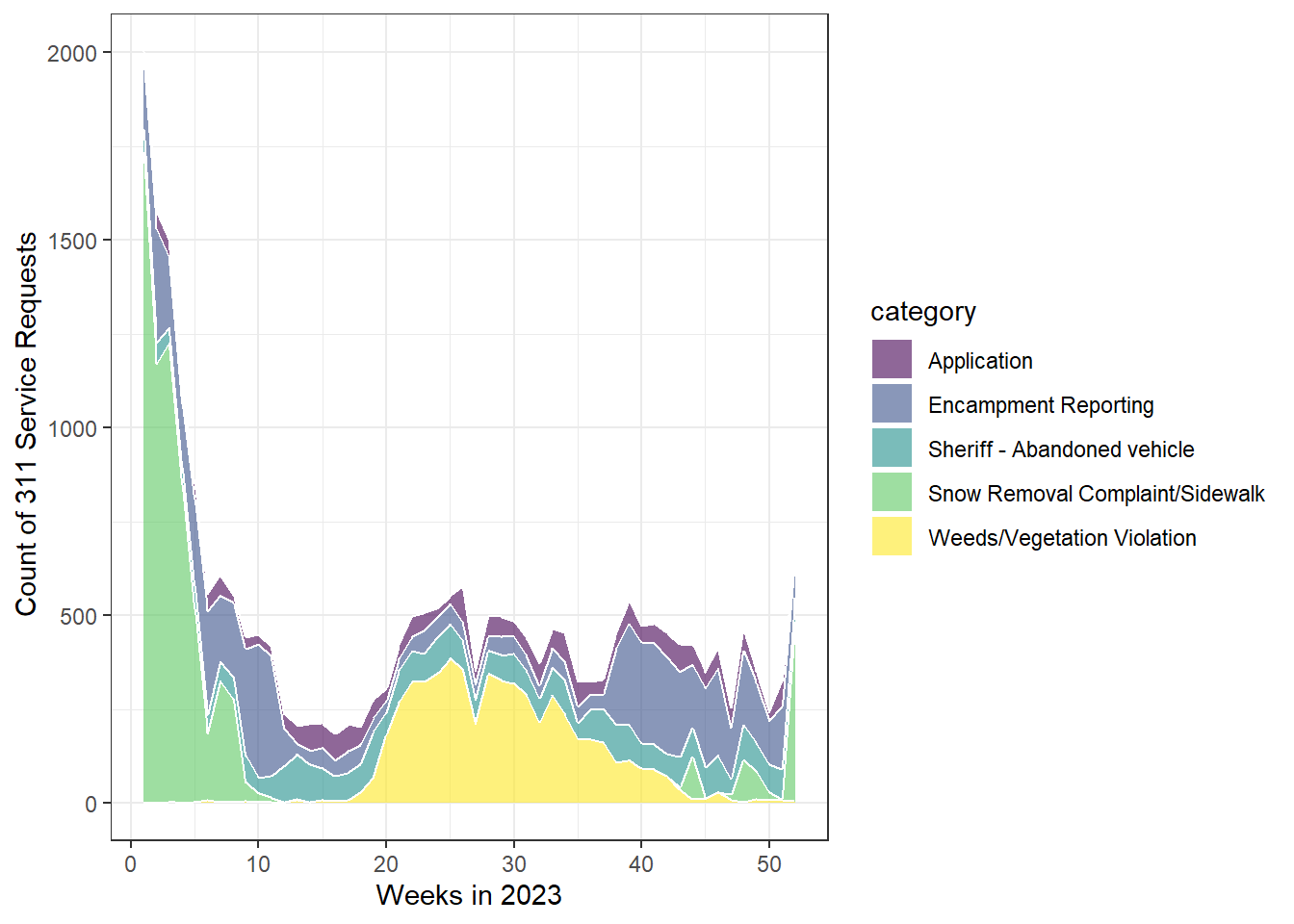
Export
# export as .pdf
pdf("plot/plot2_311_service_cat_week.pdf", width = 10, height = 6)
print(p2_311)
dev.off()
# export as .png
png("plot/plot2_311_service_cat_week.png")
print(p2_311)
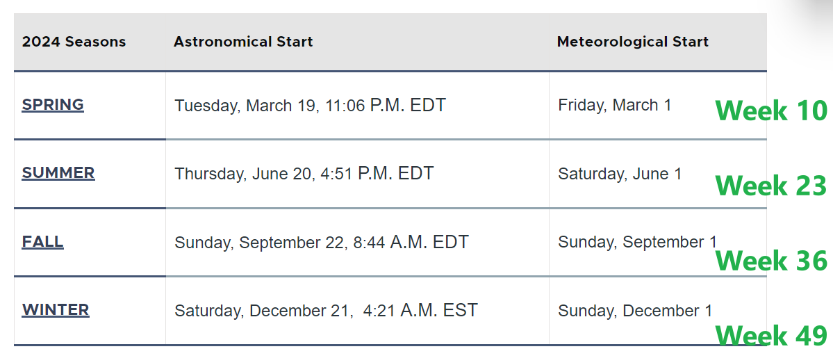
dev.off()Okay, while the plot looks better now, the week number is very confusing. Let’s add some labels by connecting week numbers to seasons as suggested by Figure 6.2.
[Q6] Please briefly discuss your findings from this analysis (plot3_311_service_cat_week_reference.pdf).
Add reference lines for four seasons.
# create a df showing when the four seasons start
df_311_season_label <- data.frame(
x_season = c(5,18,31,44),
y_season = 2000,
label = c("Winter","Spring", "Summer", "Fall")
)
# viz: improve by adding annotation & reference lines
p3_311 <- ggplot(df_den_311_top_tidy, aes(x=case_create_wk, y=count, fill=category)) +
geom_area(alpha=0.6 , linewidth=.5, colour="white") +
scale_fill_viridis(discrete = T) +
theme_bw() +
geom_vline(xintercept = c(10,23,36,49),colour="black", linetype = "dotted") +
geom_label(data=df_311_season_label, aes(x = x_season, y = y_season, label = label), fill = "white", linewidth=0.5) +
xlab("Weeks in 2023") +
ylab(" Count of 311 Service Requests")
p3_311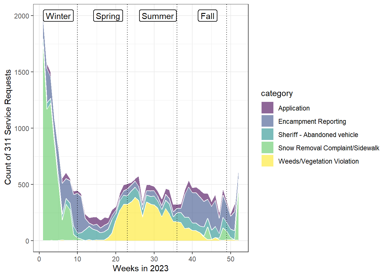
# export
pdf("plot/plot3_311_service_cat_week_reference.pdf", width = 10, height = 6)
print(p3_311)
dev.off()6.5 Viz: Mapping 311 Requests
This section moves from time-series to spatial visualization of the 311 data.
[Q7] Please open the data frame
df_den_311 and report which two columns can be used to
convert “df_den_311” to spatial data / simple features?
# open
View(df_den_311)
# list all column names
names(df_den_311)6.5.1 From Dataframe to Simple Features
Create simple features of 311 service requests and save the data as
sf_den_311.
# Convert to spatial points
sf_den_311 <- st_as_sf(df_den_311, coords = c("Longitude", "Latitude"), crs = 4326)Let’s check the CRS (coordinate reference system) of all simple features we have and project them to the 2D CRS, NAD83 / Colorado North (ftUS), which has its centroid in Colorado.
The value 2231 is the unique index for the CRS NAD83 / Colorado North (ftUS). More CRS could be found here https://epsg.io/.
# four spatial data (simple features). Let's check their coordination systems
sf_den_311$geometry
sf_den_tree$geometry
sf_den_ngbr$geometryProject three simple features, i.e., sf_den_311,
sf_den_tree, sf_den_ngbr from
WGS84 to NAD83 / Colorado North
(ftUS) .
# project the data to NAD83 / Colorado North (ftUS)
# https://epsg.io/2231 - NAD83 / Colorado North (ftUS)
sf_den_311 <- st_transform(sf_den_311, 2231)
sf_den_tree <- st_transform(sf_den_tree, 2231)
sf_den_ngbr <- st_transform(sf_den_ngbr, 2231)Quick plot of three simple features sf_den_311,
sf_den_tree, sf_den_ngbr
## map "sf_den_311" as symbols
tmap_mode("plot")
tm_shape(sf_den_311) + tm_symbols(size = 0.2, fill_alpha = 0.1)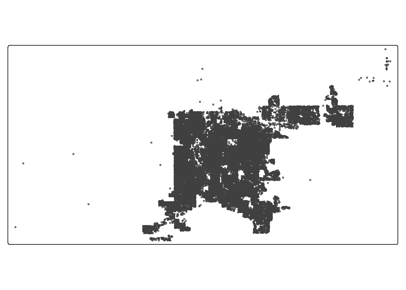
## map the first 1000 records in "sf_den_tree" as dots
tmap_mode("view")
tm_shape(sf_den_tree[1:5000, ]) + tm_dots(fill = "DIAMETER", fill_alpha = 0.2)